|
david carson
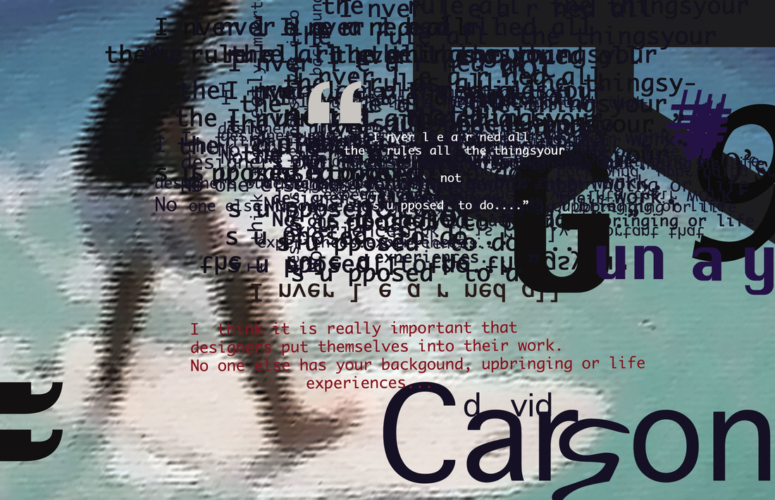
David Carson is a graphic designer, typographer and a photographer. His work consists of images and writing. He uses typography in his work, sometimes he uses text to create the outline of a person or an object and sometimes he makes the text he uses into a pattern and uses it to portray the point he is trying to get across in the image. In the photo on the left he has made the text hard to read by making overlap and has chosen to make the text red, black and blue. this could be to put emphasis on the fact surfing isn't straight forward, put emphasis on the waves and show the viewer its dangerous which is why he has the writing overlapping, looking chaotic and has the red to emphasise the danger.
|

David Carson uses photography and typography to communicate with the viewer. When I look at his work I feel free and like his work is telling me that I can just do anything I want. The fact that in his typography overlaps suggests that the message he is trying to get across is that it's not all about appearance and that it shouldn't always matter how you present yourself or something. The image on the left also suggests he doesn't care and wants the viewer to see that he's prepared to take risks and not play it safe all the time. Normally writing starts on the left of page and goes towards the right but in that image he has chosen to put the text towards the right side to really show that he's being different. David Carson likes surfing and has combined his hobby with his work to emphasise the point of doing things that you enjoy and by linking his hobby and his work it tells the viewer he enjoys surfing and designing. David Carson's work has inspired me to combine my experimental traditional art work with my digital work to create narratives that way as it makes the image look visually stronger and doesn't look like there's something missing when I have combined my digital and traditional work.

|

I took some images from the internet, scanned in my drawing of Margaret Thatcher and used the layers tool on photoshop and clicked multiply so the imagess would appear transparent. I then printed the edited image off in black and white and chose to rip certain it up into sections to show what London was like before Margaret Thatcher changed it in comparison to what London's like today. I chose to print the image off in black and white to suggest that London was missing something and I also ripped up in sections to show that not all of Britain was connected together, because of all the issues that still occurred like sexism. I was inspired to produce this after looking at David Carson's work.
|

This image consists of two experiments I completed. One just had the text and the other had neswpaper, drawings and magazine rippings. Before I combined them I tried to work out how to create a good composition so focused on where I would place the text. After that I scanned both experiments in to photoshop and used the layer and multiply tools to combine my work and make a final outcome for the decade 2000 in response to David Carson's work.
