thom yorke & stanley doonwood
Stanley Donwood is well known for his painting, graphic design and drawing. Radiohead is an English alternative rock band that he has worked with and is best known for creating their artwork. Since 1994 he has created the band's entire album and poster. Thom Yorke is a memeber of the band Radiohead, he is an english musician best known as a singer and prinicipal songwriter. Stanley Donwood has also created artwork for Thom Yorke's solo band Atoms For Piece. They first met each other as students at the University of Exeter.
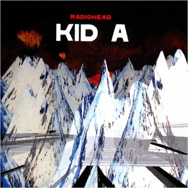
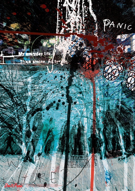
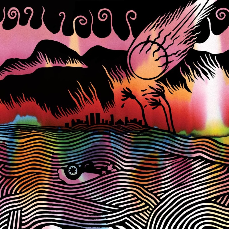
I like Stanley Donwood's artwork because the use of line and colour in his work makes the image look really interesting and grabs the viewers attention. The use of text in the first image with the words Kid A makes the image stronger, the writing has been positioned in the center and the white and red stand out infront of the black background. I really like the second image and think the colours have been used appropriately. The image looks like the vibe rock gives off, the lines represent and explosion, the intenisty of the music, the lines remind me of how the sounds of the instruments would appear on computer software, the blue and black link to the emo lifestyle, darkness and depression, the red represents the danger and energy behind rock and reminds me of people rioting which is supported by the word panic. Underneath the lines are people in black who appear to be affected by the vibe of rock and have allowed it into their souls. The final two images seem to be of Hollywood coming to an end due to a tsunami and meteor strikes which could imply that eventually the world of Hollywood and superstars could come to an end in the future. The use of the colour black and white could suggests that the future for the Hollywood industry could be quite negative and gloom.
I like Stanley Donwood's artwork because the use of line and colour in his work makes the image look really interesting and grabs the viewers attention. The use of text in the first image with the words Kid A makes the image stronger, the writing has been positioned in the center and the white and red stand out infront of the black background. I really like the second image and think the colours have been used appropriately. The image looks like the vibe rock gives off, the lines represent and explosion, the intenisty of the music, the lines remind me of how the sounds of the instruments would appear on computer software, the blue and black link to the emo lifestyle, darkness and depression, the red represents the danger and energy behind rock and reminds me of people rioting which is supported by the word panic. Underneath the lines are people in black who appear to be affected by the vibe of rock and have allowed it into their souls. The final two images seem to be of Hollywood coming to an end due to a tsunami and meteor strikes which could imply that eventually the world of Hollywood and superstars could come to an end in the future. The use of the colour black and white could suggests that the future for the Hollywood industry could be quite negative and gloom.
|
|
|

|
